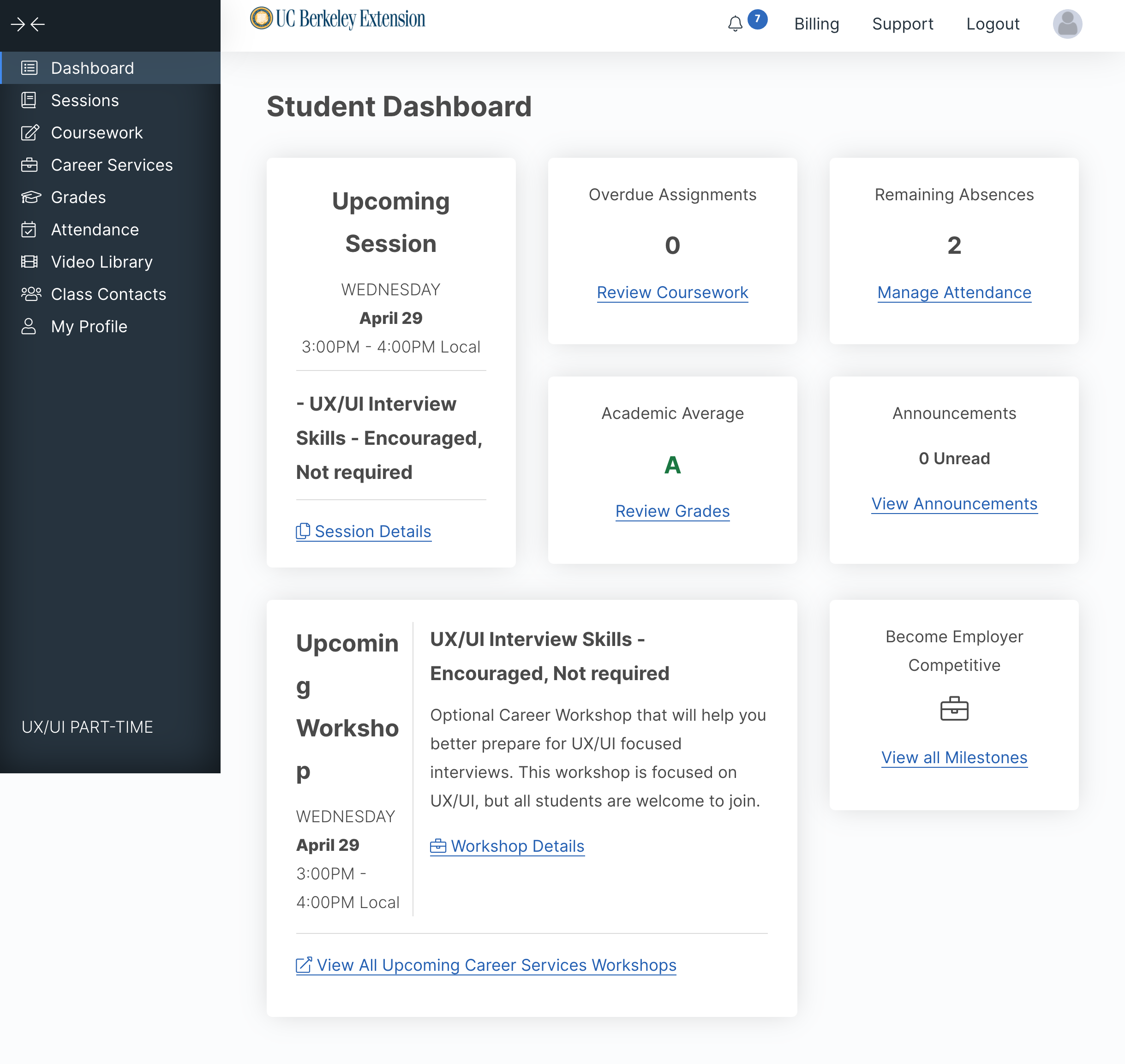
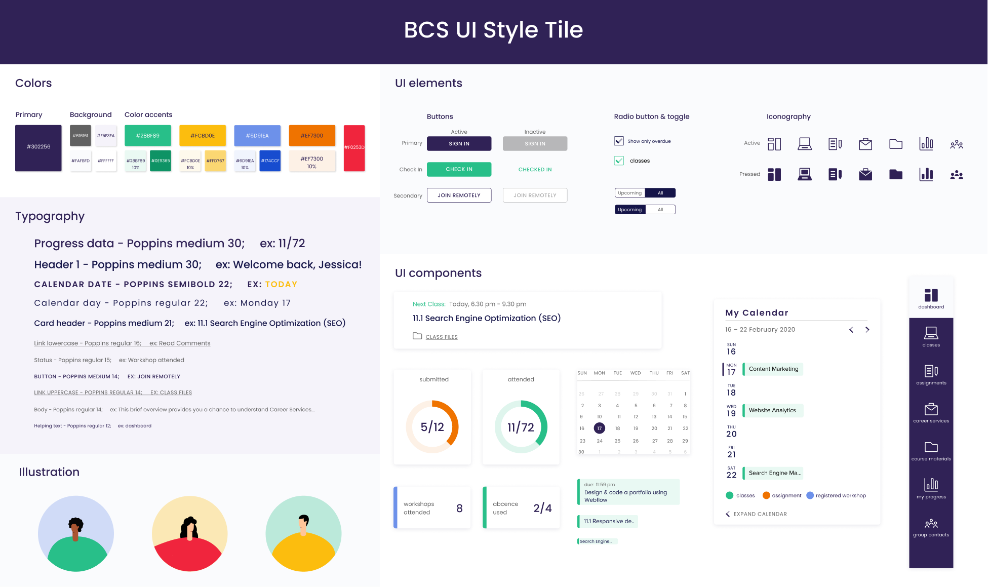
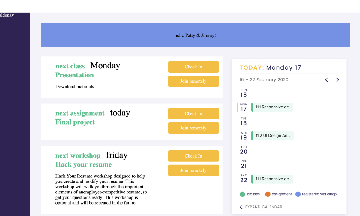
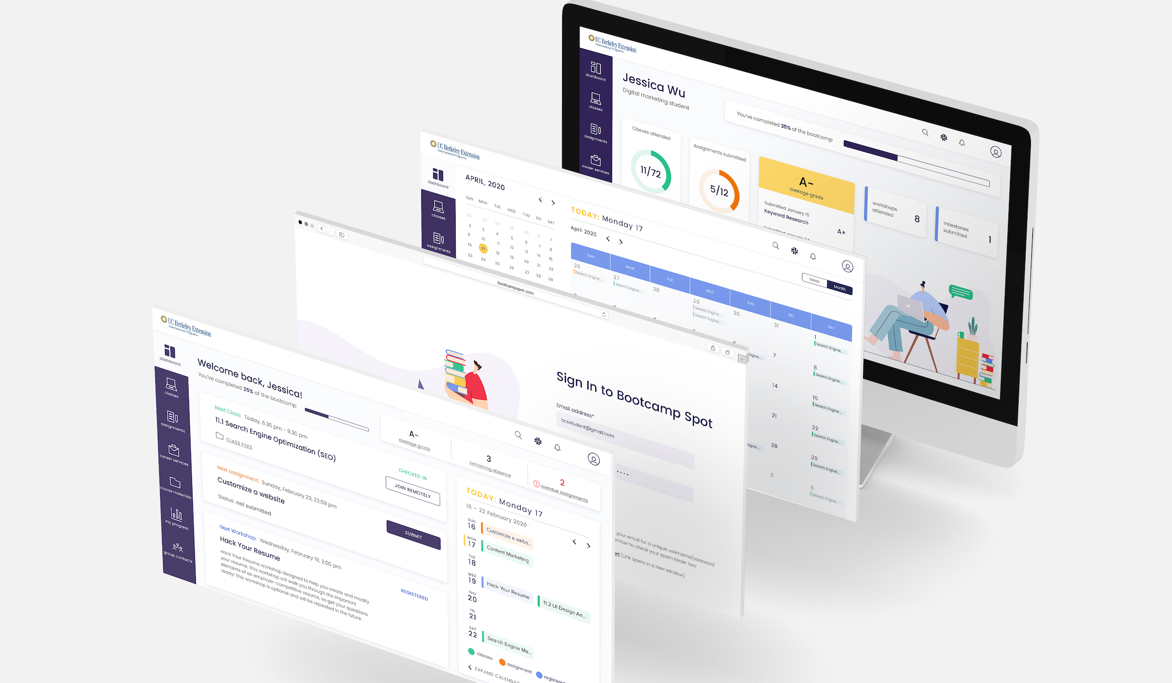
UX/UI Design Graphic Design Illustration About Me Contact Me My Resume
UX/UI design


Bootcamp Spot redesign

(quarantine project 🦠)

Bootcamp spot is an educational space for UC Berkeley Extension students and faculty. Students access this site to check-in to class, submit homework, check grades, view upcoming workshops and check their progress.

We worked as a team of three designers and being bootcampers ourselves we've been using BCS for 6 months and know the experience from top to bottom. We found it ironic that a UX design bootcamp has a website that clearly requires some UX improvements. Therefore, for our final project, we decided to redesign Bootcamp spot in order to provide future students better experience and increase their satisfaction with the course.

Type

UX/UI, web design

Time

2 weeks

My role

UX/UI designer
Front-end developer

Overview


We wanted to create a platform that is focused on the users needs. With all of the useful info on BCS, we want it to be the tool that students use for more than just checking-in and submitting homework.

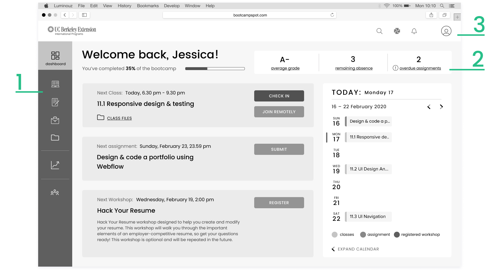
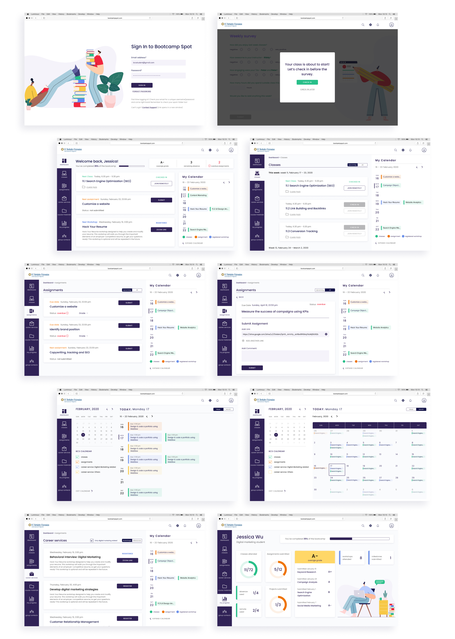
The current layout of the website is not optimized for the tasks that are performed most frequently by the students. We want to address this problem 
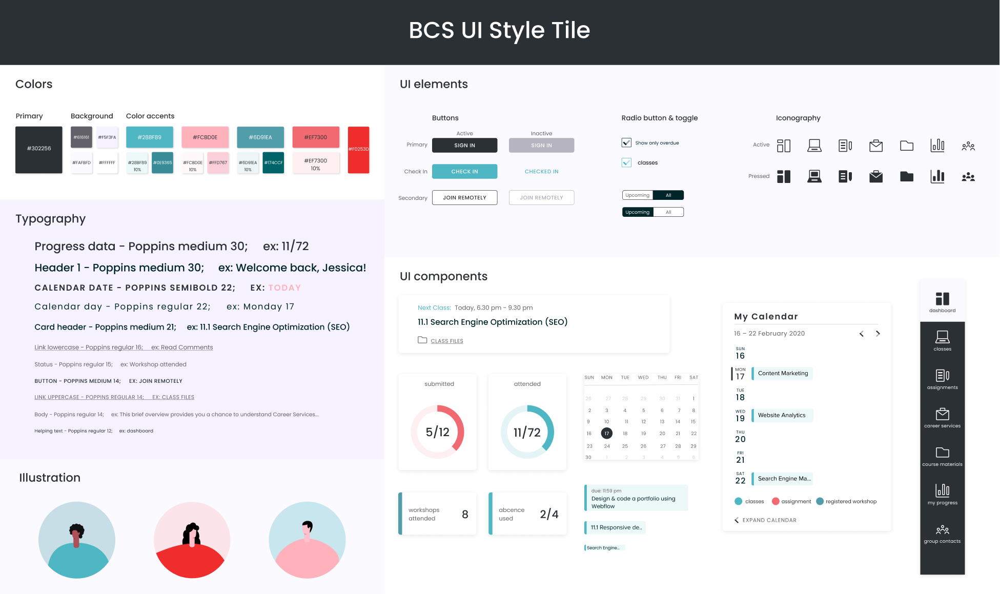
by redesigning the structure and layout of Bootcamp spot. Creating better information hierarchy, user flow and visual design will increase students satisfaction with using the platform.


Goals

  • Find user painpoints

  • Understand which features students access the most and what are their expectations from the student platform

  • Define information architecture


Old version of BCS website

Website is not optimized for students needs, users have difficulties performing basic tasks because of the platform's lack of user focused navigation and structure.

Redesign BCS by improving the information architecture, UI elements, and navigation that will give students a delightful experience, maximize their return of investment and help them being successful in reaching their career goals.

Research questions
  • What tasks do users complete on Bootcamp spot?

  • How satisfied are users with the current layout and functionality?

  • What frustrations and difficulties do users face using BCS?

  • How often do users access the site?

  • How often do users attend workshops and use career services?


Heuristic evaluation & UI annotations

Evaluating the current layout and UI design was helpful in understanding what areas of the platform need improvement. Also we were able to identify the impediments in the user flow that are preventing users from completing their tasks. The main problems that were found are the following:

  • Unclear information hierarchy

  • Lack of visual accents, page is difficult to scan

  • Repetitive information and empty sections

  • No differentiation between primary and secondary call-to-actions

Survey

We shared survey with past and current bootcamp students to collect information and data points about consumers' needs. This graph shows what features are used the most on the platform. Only 4% use Bootcamp spot to explore career services, while the main goal for the majority of students is career-related. So how can we improve user traffic in this area?

Another interesting discovery is that 58% of students never use mobile phone to access BCS, while only 7% use their phone often and 0% replied 'always'. When we were brainstorming, we thought that an app would be important for BCS site, however our quantitative data made us stay focused on the responsive desktop version.

Identifying user needs

In order to gather more data we interviewed 3 non-BCS students as part of competitive analysis. The research was focused on getting additional data on user experience with other university tools. We were able to get info from the respondents about what works well, what they'd like to change, their wishes, needs, and how they evaluate overall interaction flow. All of this helps to understand how we can improve BCS site. All 3 users emphasized visual simplicity and easy navigation of non BCS tools in the research.

Gudny
'Overall it is a pleasant experience! I only wish integrated communication tool was better, I rarely use it due to its inconvenience.'

Ren
'I find the calendar helpful, as it would foreshadow the semester'

Bryan
'Very simple to use. Almost every action takes no more than a couple of clicks.'

User persona

Analyzing and combining data from surveys and interviews helped us build our user persona. Jessica Wu is a Digital marketing bootcamp student at UC Berkeley extension. Her main goal is to gain new skills and find a better job that will allow her to become more flexible.

Storyboard

During research we discovered that checking-in and turning in homework, really easy tasks in theory, might be confusing and require too much unnecessary effort. Weekly syrvey blocks checking-in every Monday and it was clear that we have to find a solution to get to the dashboard faster. That's what Jessica's (and any other former or current student) Monday looks like.

Open Peeps by Pablo Stanley

Information architecture

Feature prioritization

We conducted an I like / I wish / What if activity, taking our personal and our research insights into account, and pulled these important priorities:

Card sorting

A quick card sorting activity, done by our shelter-at-place partners, helped us reimagine the sitemap. Although the layouts look different, we found similar themes of content that we took into consideration working on Information Architecture.


Yessi placed cards in 4 main categories that helped us envision what would be our pages

Arnar & Floki grouped items that mattered most to students into what turned into our dashboard contents

Kosta helped us realize how the calendar can play an integral role in managing all events

Userflow


For the userflow we chose the most common task that every student complete 3 times a week - checking-in to a class. To make it more dramatic we narrowed the flow to Monday check-in, the day when we all have to submit weekly survey.

Before

The shortest journey takes user 14! clicks. (For better understanding of the flow you can see here what old BCS calendar looks like on a 13" laptop.)

After

There's no difference between Monday or any other day - it takes a student only 2 clicks to check-in to class.

Paper prototype


Ideating led us to different visions for the layout, and what can better calibrate what’s best for our users than A/B testing? We put both of these paper versions (aka 'sent InVision link') in front of different testers, and took away the best of both, for instance, ability to join remotely from the homepage and personal stats that stand out (version on the left), customized calendar on the dashboard and progress bar (version on the right).

Lo-Fi prototypes


We took what worked well from the paper prototypes and implemented into the Lo-Fi prototype. We spent the most amount of time at the Lo-Fi stage and had multiple iterations and 11 user testings to be sure that we deliver the smoothest user flow at the end product. At usability testing we were interested in 3 workflows:

  • checking-in to class

  • submitting homework

  • looking for UX related career events

Lo-Fi prototype V.1

In our first lo-fi prototype we created the dashboard without navigation bar. We assumed that users can navigate through the site with side buttons on the cards (1). The majority of users got confused and didn't understand that these were clickable areas.

Then we asked to submit overdue homework (that was in 'my assignments') and some thought that statistics area (2) is clickable, which we did not intend.

Finally, a half of testers said that top menu (3) is functional but cluttered and is lost on the page.

Lo-Fi prototype V.2

We took user feedback into account and improved the Lo-Fi prototype by bringing back a side navigation (1), making stats area clickable (2), and minimizing secondary nav on the top (3).

Design system

In parallel we were building our style tile. It consists of the fonts, colors, interface elements, and sample imagery (we customized illustrations by @khairitdinov) that communicate the essence of our visual brand. We wanted to create a platform that invites user to stay and explore, so we use calm dark blue as a primary color and balance it with bright accents and negative space. We use a super family Google font Poppins that has high readability. It’s a geometric sans-serif that has big round characters and good spacing. Its big lower letters relative to the uppercase keeps the font from being boring. UI elements and components include primary and secondary buttons, toggles, cards, calendar and a set of icons that we created.

No visual impairment

To be sure that we can move on with the chosen options we conducted a color blindness test to see if our design decisions support accessibility needs. The examples below show how people with 4 different types of visual impairment would see our style tile. Yes, it looks very different from the original one, but there’s still difference between primary and secondary actions and good contrast.

Achromatopsia vision

Deuteranomaly vision

Achromatomaly vision

Tritanopia vision

Hi-Fi prototype


Here are the major changes that we made:

  • First of all we reduced amount of questions in the survey. Based on our research among bootcamp students and our own experience we kept questions that are more important.

  • Dashboard cards now show next class, next assignment and next workshop. We used accent colors throughout the website to help user categorize them.

  • Next class card allows student to quickly check in, request remote attendance and get access to session materials. Next assignment card has prominent 'submit' button.

  • When students register to the next workshop it will right away appear in their personalized calendar on the right. This calendar will only show events that a person is registered to or that are required. We don't want to overwhelm user with unnecessary information. However, calendar can be expanded to a full weekly or monthly view to see all upcoming events and filter them.

  • Lastly, we added a progress page. We wanted to create a place where a student can get all the necessary information about progress and current state in their course.


Video of Hi-Fi prototype

Coding 🤓


I applied some coding to achieve what our dashboard page would look like. I intentionally didn’t use Bootstrap or Codepen (or any other open source) and built a fully responsive page using old-school HTML and CSS.

Step 1

First stage - defining the sections & divs. Looks quite ugly but really helps to see the structure of the future dashboard. It took me about 5 hours to build the core structure in HTML.

Step 2

That’s what it looked like after applying some CSS (+4 hours). Almost good.

Step 3

And that's the coded version (+1 day). It looks exactly like the Hi-Fi prototype and it's fully responsive.

At landscape tablet orientation the layout updates. To keep the main focus on the upcoming events, I moved the calendar bellow the fold. Now the calendar takes the full width and shows monthly view. In the vertical orientation on a tablet both side navigation and top navigation goes to burger.

In the mobile version the calendar is back to the weekly view that is optimized for the smaller screens. I removed the stats from the home screen, since they’re always accessible on student's progress page. I did it to be sure that check-in button, the most used during the course, is always above the fold. So even when a student is running late it’s easy to check-in with a mobile.

And all of this is powered by real code!

Video of code

KPIs & Next steps

KPIs
  • Time spent on the site

  • Satisfaction survey

  • Number of site visits per day

  • Career services sign-ups

Next steps
  • Adapt to the current situation, add more remote-friendly solutions

  • Add resources page where students can store all the shared links, articles, books etc.

  • Send push notifications to the email or phone to remind a student to check-in, submit assignment or attend workshop


Designed & developed by Yulia Chilikina