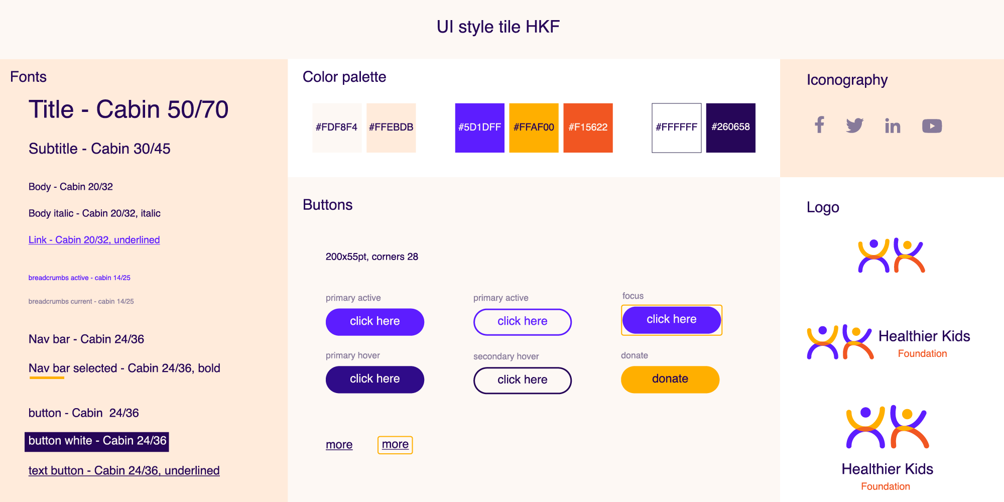
UX/UI Design Graphic Design Illustration About Me Contact Me My Resume
UX/UI design


Healthier Kids Foundation

redesign

Healthier Kids foundation (HKF) is a family forward health agency that gives children and those who love them the education and tools they rightfully deserve to live a healthy life. The organization’s website is dated and does not provide the best user experience and in order to increase its impact the site needs to be redesigned to better connect with its audience.

The purpose of this redesign project is to improve user flow, build more intuitive information architecture, develop visual consistency, and as a result make it easier for the users to reach their goals on the site.

Type

UX/UI, branding

Time

3 weeks

My role

UX/UI designer

Overview


The goal of this three week long project was to redesign a non-profit organization's site. Our small design team, consisted of Pooja Bhangay and me, wanted to use this opportunity to help 
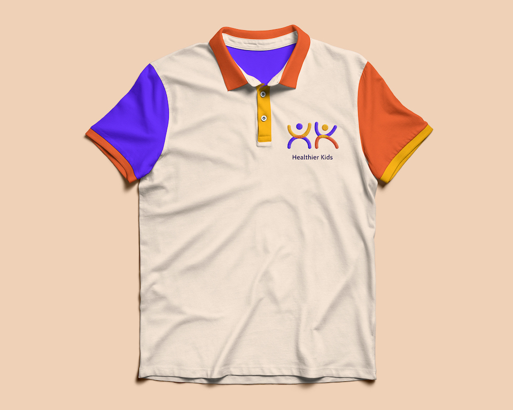
and we chose an organization with a huge impact - Healthier Kids Foundation. 
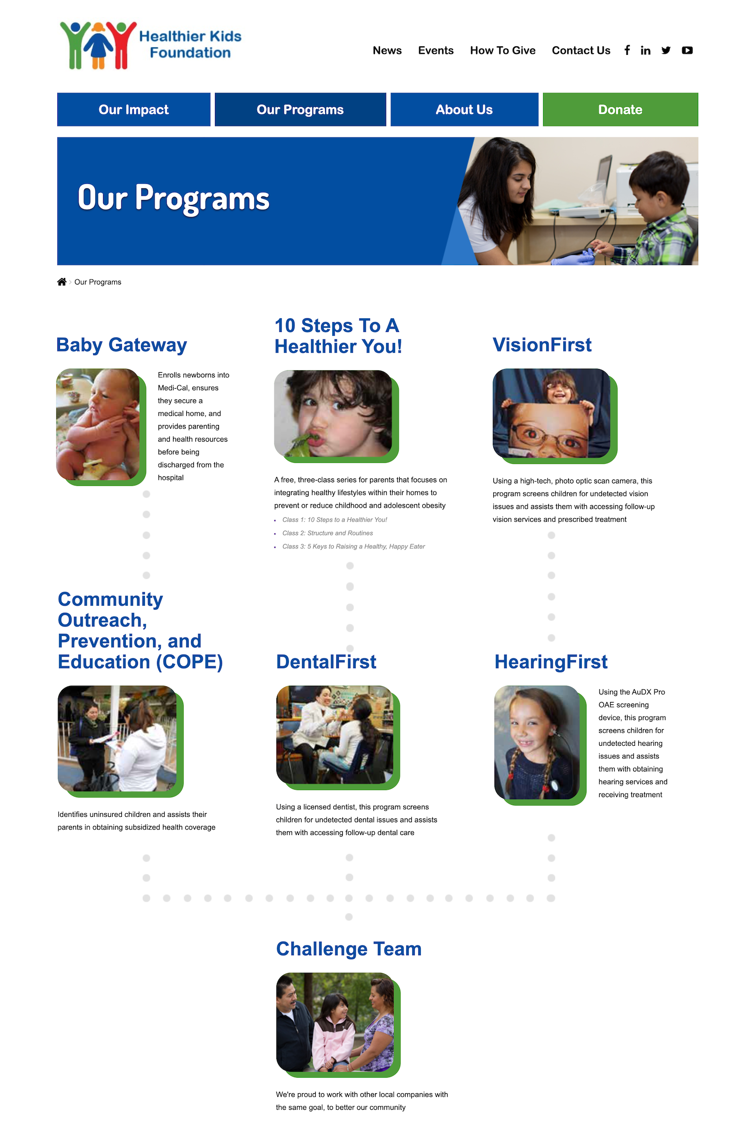
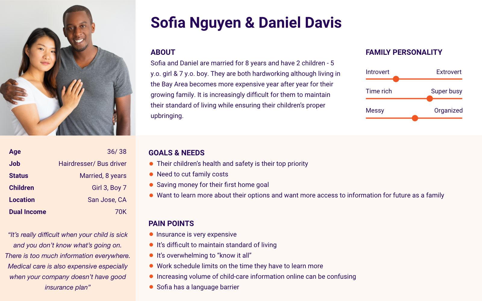
It is a non-profit health agency based in San Jose, CA, that provides children, their parents and care takers medical services and screenings as well as educational programs and integrates healthy lifestyles into home environments.

According to HKF's Salesforce data there's thousands of mothers and children who received help with the organization and over 3,400 children who were successfully enrolled in subsidized medical insurance plans since 2016.

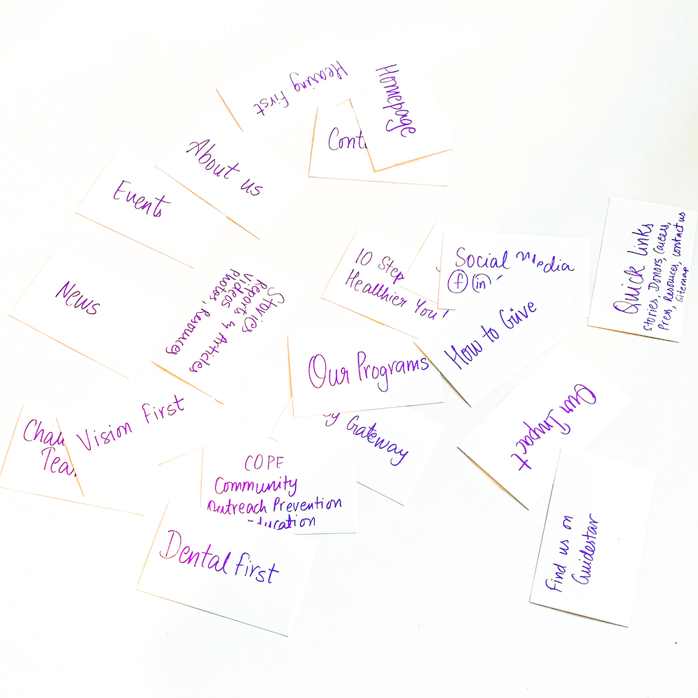
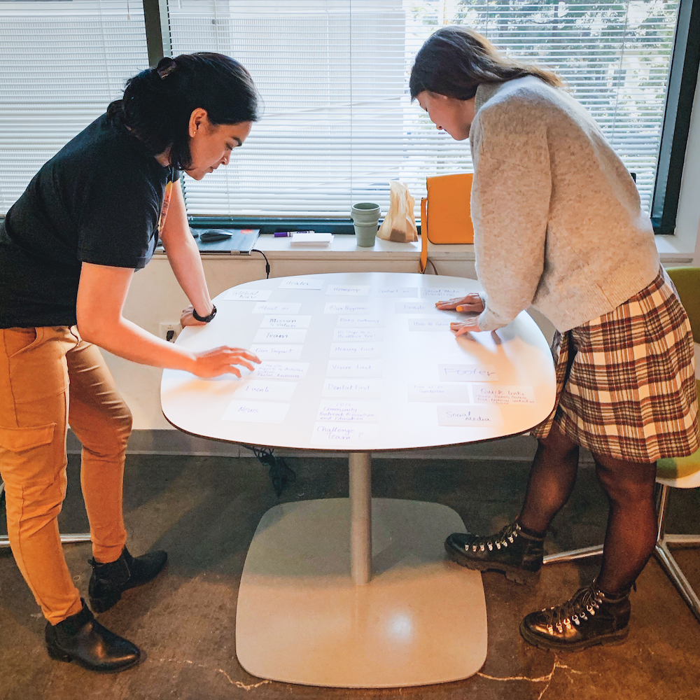
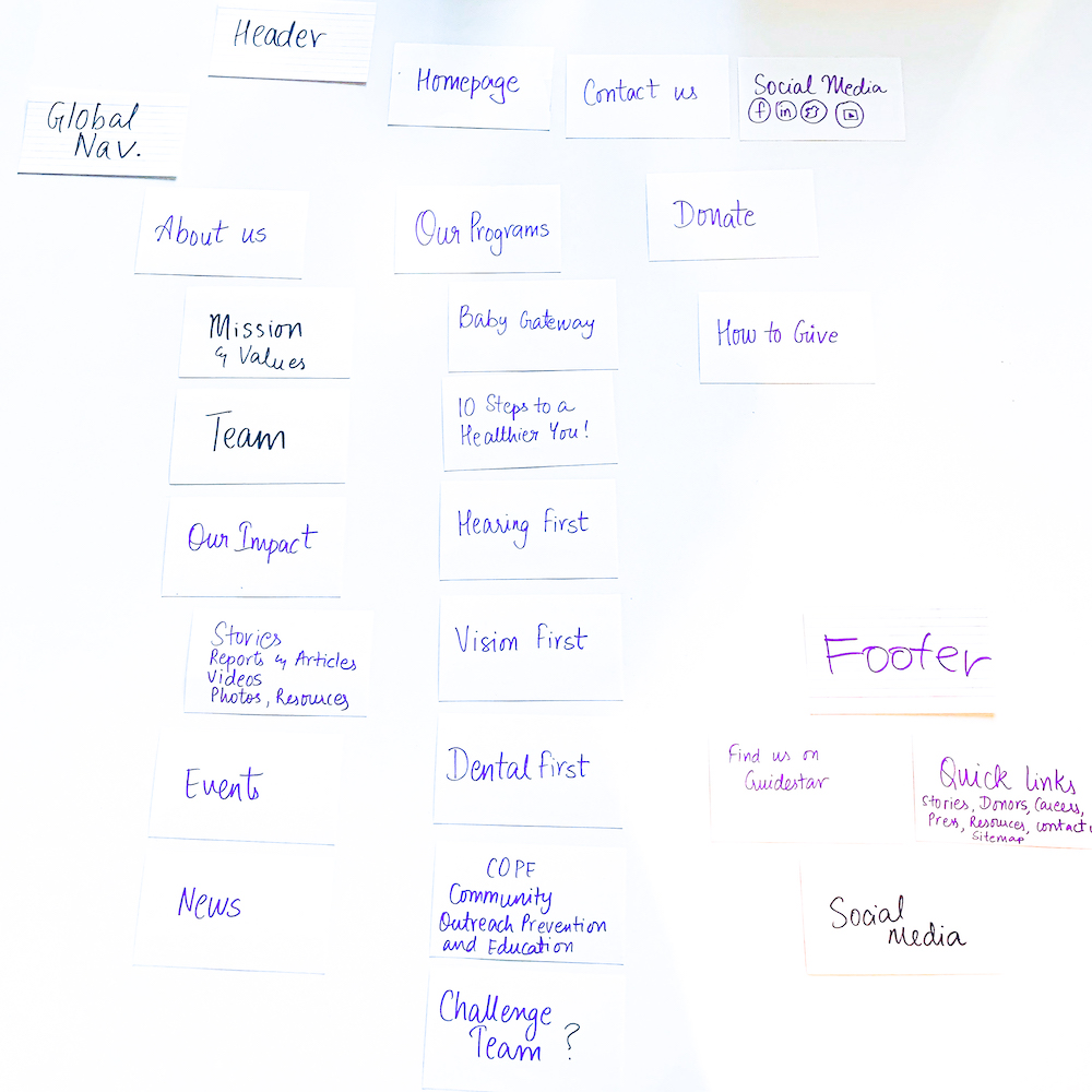
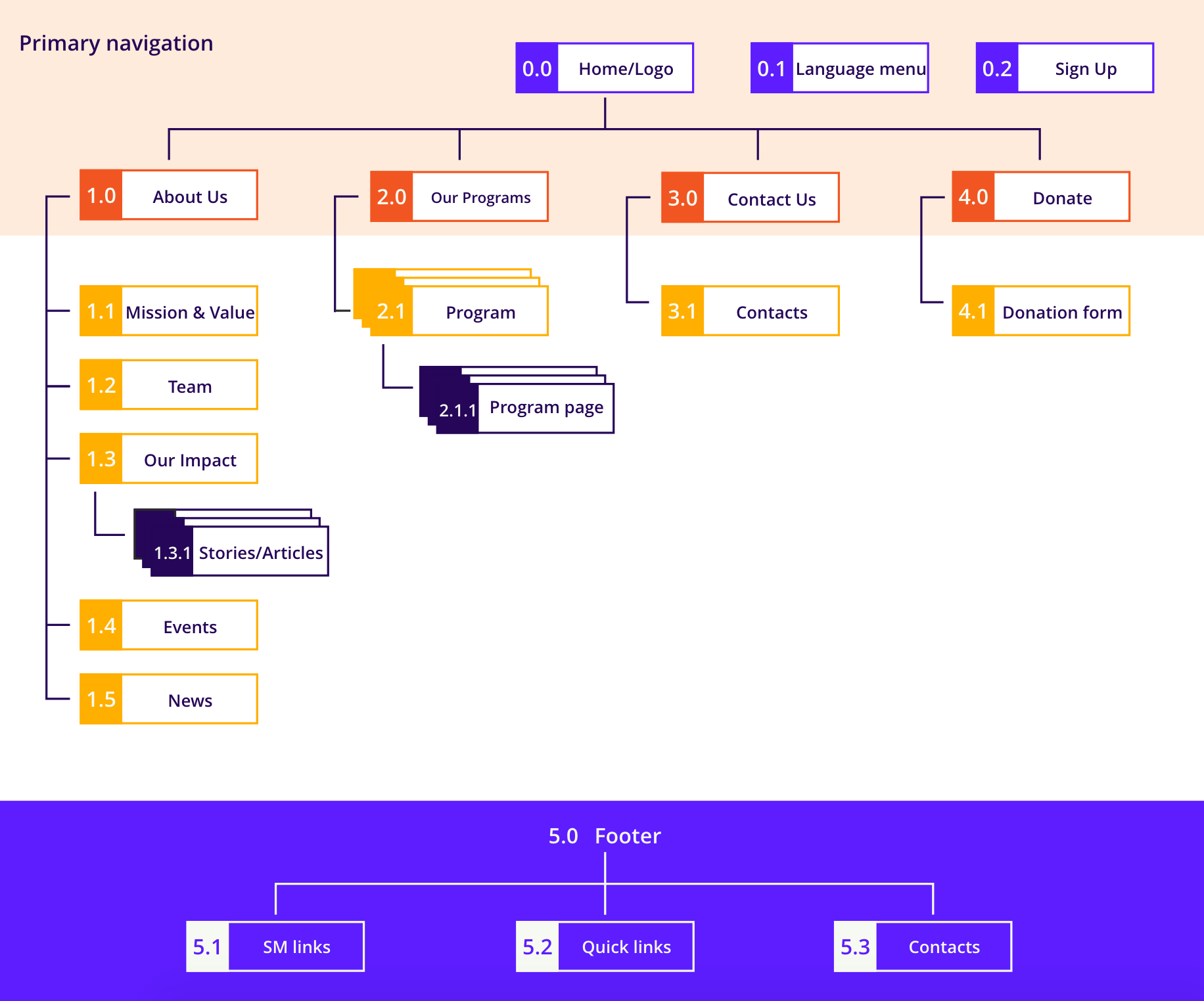
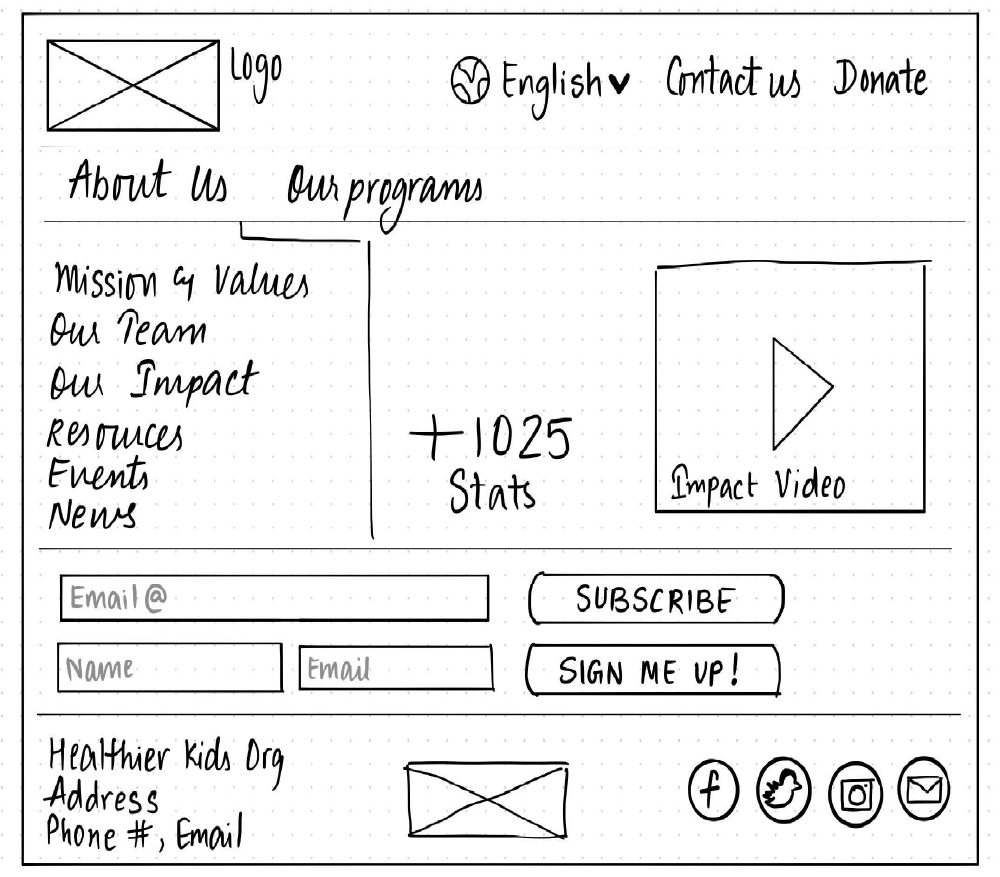
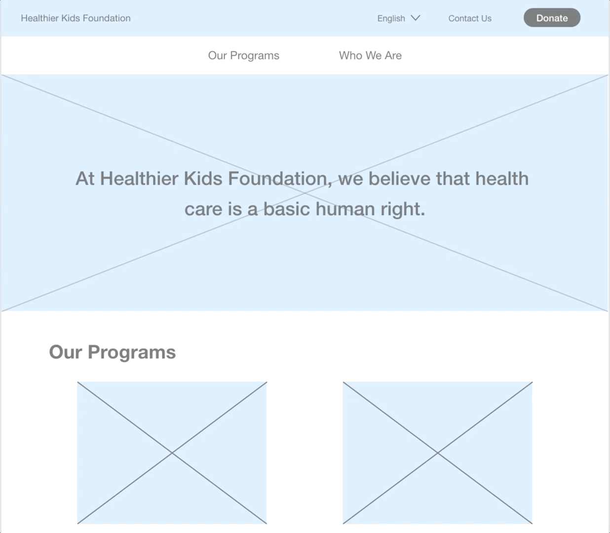
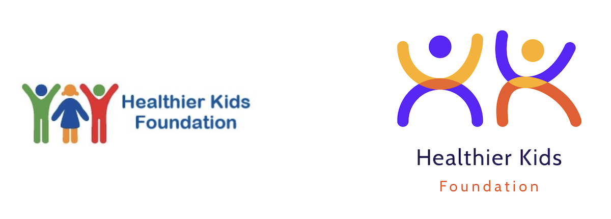
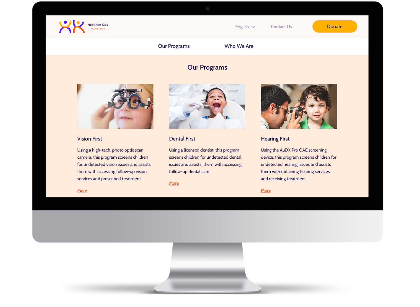
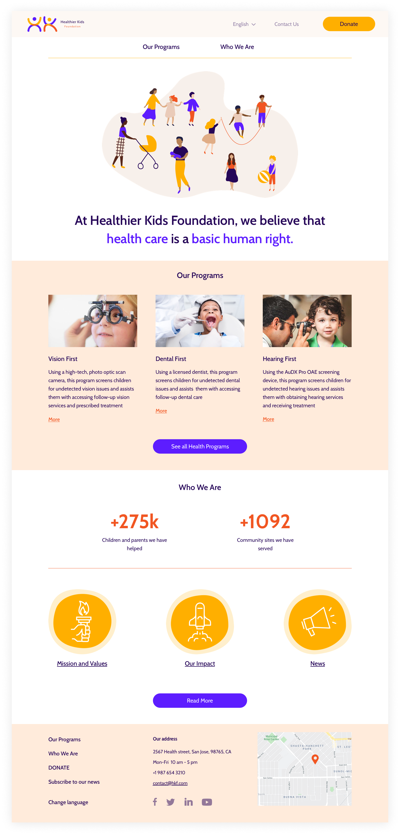
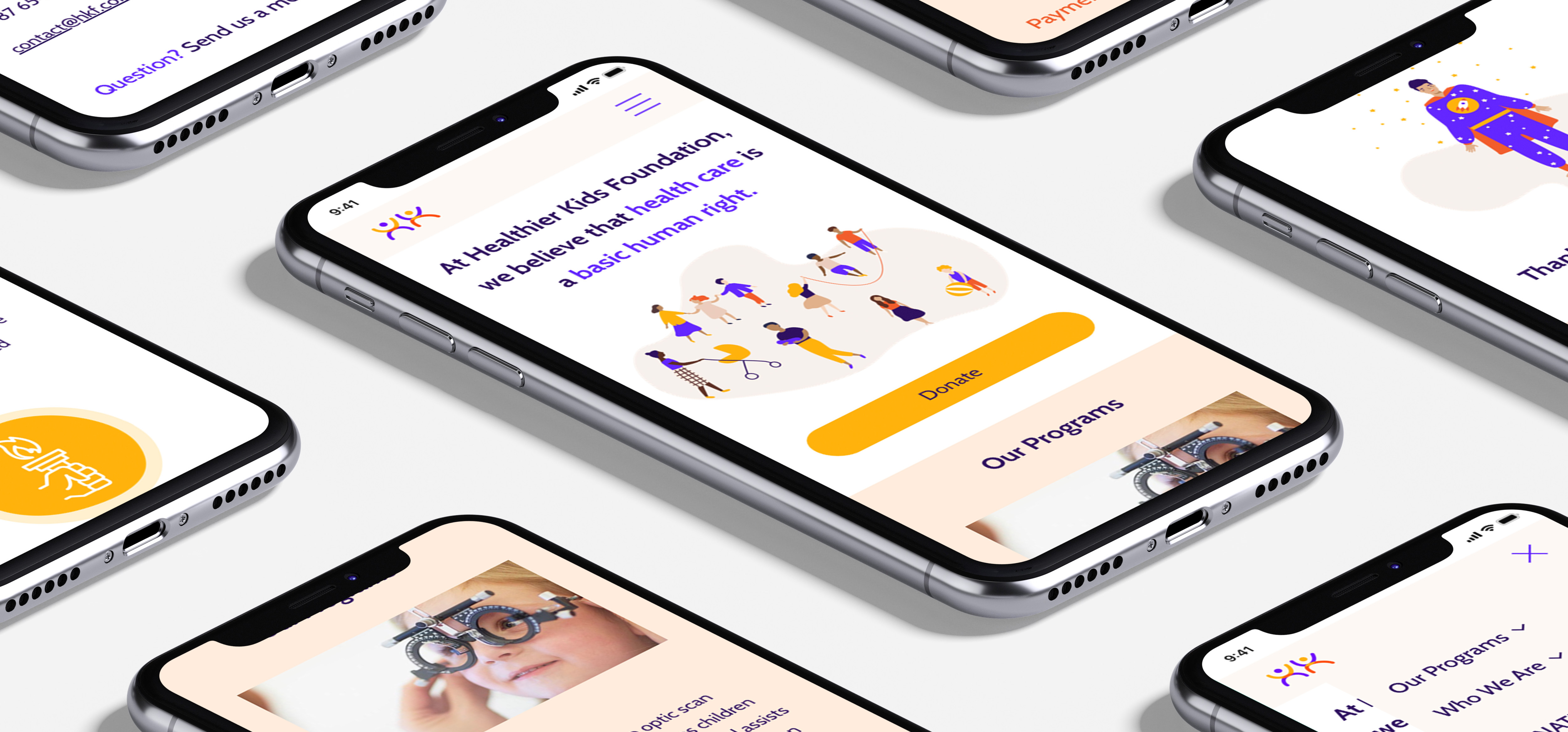
​ However, the inconsistent design, poorly structured content, cluttered interface and unclear information architecture of HKF website are resulting in unpleasant and inefficient user experience. With the constant social need for its services Healthier Kids Foundation needs a visual overhaul of their website to grow its reach and impact.

Old version of HKF website

Primary research

We started with pulling the population data and statistics for San Jose, California. According to the most recent census report (2019) on Santa Clara County only 41% of the population have English as first language. The majority (57.6%) speak language other than English at home. So, in order to make this site accessible to more people we have to add multilingual support.


Competitive analysis

Analyzing direct and indirect competitors helped us identify the strengths of our organization:

  • values and mission

  • wide range of programs

  • high impact

as well as weaknesses & threats:

  • low accessibility

  • poor IA

  • too many third-party links

Heuristic evaluation

When we conducted an in-depth Heuristic evaluation and made UI annotations we learned that:

  • the color palette is too complex and it does not pass the color testing completely

  • there are visual inconsistencies with photography and elements throughout the website

  • basic gestalt laws are not followed

Usability testing

To be able to further empathize with users and identify their main painpoints and needs we conducted 8 user testings of the current site. We interviewed parents, teachers, and caregivers from the Bay Area and observed their interaction with the system while they were performing the same set of tasks - find the mission of the organization, find the vision screening program, and make a donation. ​

Problem & Solution


HKF has a lot of health programs that are very difficult to access and consume.
Our solution is to improve UX flow, focusing on navigation and information architecture.

Identifying user needs

In addition to usability testing of the HKF website we interviewed parents and caregivers to understand their needs and frustrations in general, unrelated to the HKF. During this process we were able to draw patterns about the main painpoints which were mainly focused on the overwhelming amount of information, lack of time and financial insecurity.


Tiffany, educator
'Sometimes you feel lost and useless when a kid is sick and you don't know enough to be helpful'

Jenn, director of merchandising
'Having a baby is expensive. Medical care is also expensive especially when your company doesn't have a good insurance plan'

Chris, accountant
'It's really difficult to multitask and be efficient at work when your child is sick but you don't know what's going on'

User persona

Based on interview observations, organization's data and preliminary research that included Santa Clara Country Census report we created our user persona that we use as a reference point in the future project development.

Information architecture


Feature prioritization

By the end of our interview analysis, we were able to cluster the responses in categories. At the same time, we conducted an I like / I wish / What if activity among 8 participants. All this allowed us to define the main features that we'd like to incorporate in the new design.

Card sorting

As mentioned above there is a huge scope for improvement in IA of this website, and a quick in-person card sorting exercise helped to explore and solve the major gaps in the Information Architecture that was used to recreate the sitemap.

Before

Trying to create structure

After

Sitemap

The structure of the future website and an updated sitemap are based on the card sorting results.


Paper prototype & Lo-Fi


After sketching a paper prototype, we made 2 versions of Lo-Fi digital prototype and performed A/B testing. Users feedback and recommendations together with our observations were integrated into the Hi-Fi prototype.

Paper sketch

Lo-Fi prototype

Design system

In parallel with defining, ideating and prototyping phases we were building project style tile. Our goal was to create a color palette that is associated with kids and provokes positive emotions. We wanted the new page to look gender neutral, soft, friendly and modern and at the same time avoid standard medical colors such as blue or green. So, we ended up with a pastel palette with bright accents.

To maintain the soft look all the UI elements, such as buttons, have rounded corners and smooth lines. For the same reason we used font family "Cabin" as it has elegant rounded letters and has high readability.

No visual impairment

One of the main goals of the project was to make the new version of HKF website more accessible, so we tested our style tile for two common color blindness conditions, Protanopia and Tritanopia. Although color palette looks different from the original one, the elements still look contrasted and it's easy to differentiate primary action from the secondary, as well as donate button stands out.

Tritanopia vision

Protanopia vision

Another challenge of visual redesign was making a new logo. Initially it wasn't planned. However, during our first round of interviews respondents mentioned that they like the concept of the current logo and that made us pay more attention to it. Interviewees specifically liked the use of multiple colors and the mood it conveys, when people look at the logo it represents happy children and we definitely wanted to keep that aspect. However, I found a couple of issues with existing logo that motivated me to redesign it. First of all, it is very complicated and hardly responsive. When it’s small it’s not easy to differentiate 3 people and see details. Next, it exists in 1 variant - horizontal positioning with text on the side. That makes it even less responsive and hard to use for the vertical layouts. And lastly - it resembles a restroom sign which is hard to unsee once noticed.

So, taken all that into account I created a new HKF logo. It's recognizable, more balanced, simple and responsive and can be used in many layouts.

Before (on the left) and after (on the right) versions

Responsive Hi-Fi prototype

Desktop homescreen

We brought organization's value proposition to the homepage to avoid confusion about HKF specific. It's followed by the list of three most popular health programs and then by secondary information. Donate button grabs attention right away. And we incorporated language menu, so that user can immediately change language. We used 12 column grid to make the new HKF website responsive and optimized for laptop, tablet and mobile.


Mobile flow
Future steps

By the end of this project we were able to deliver a redesign proposal with the intent to present it to the management at the Healthier Kids Foundation as per our communication. The key data shared by the CEO in our Ideation phase helped us validate our claims and strongly hold onto research while we navigated through the redesign process.

Here are some fun directions for the website design that we plan to undertake in the future.

  • A Sign-up option to access the online health portal and files of the child that will have information about appointments, reports, etc.

  • Live instant messaging chat option with a nurse.

  • Live-video chat with a doctor with real time language translation subtitles.


We have also created merchandise prototypes with new logo that can help generate extra funding opportunities for the non-profit organization.


Designed & developed by Yulia Chilikina